
How to optimize your Product Pages for better Conversions
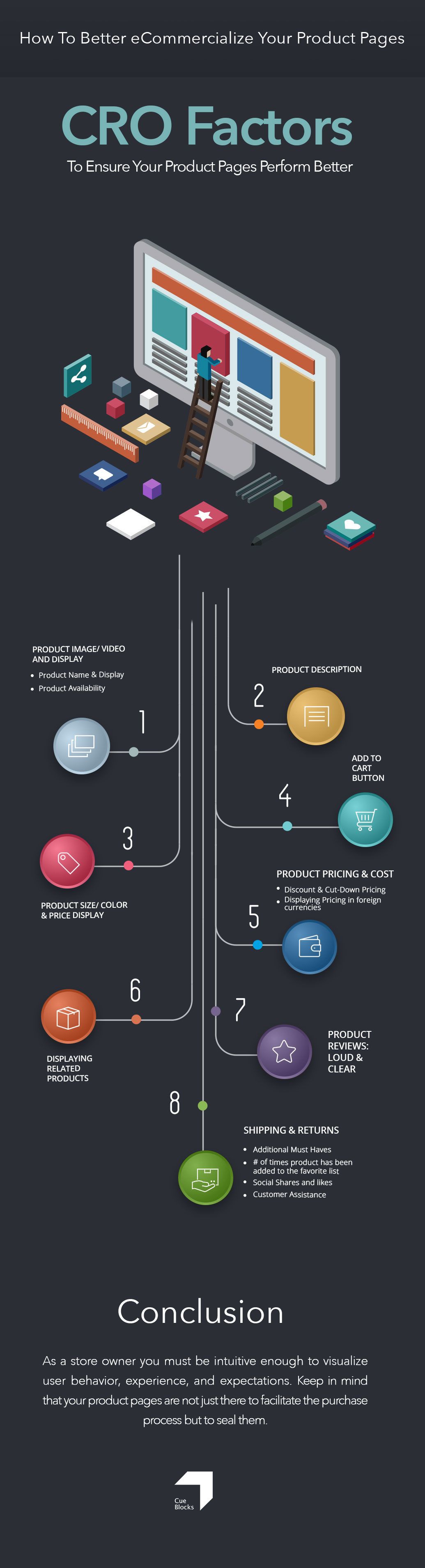
What makes eCommerce stores, eCommercial? Well, the products that you are selling online! So why is it that we ignore the most sacred pages of our web-stores – the product pages – and give them a step-motherly treatment. We have our nicely designed home pages, the slick, and navigable category pages but the moment we click those product pages, we are welcomed by deadness in the form of vapid product descriptions, a low-res product image and even a poorer call to action. The common assumption, also, a target-destroying one is: the user who has reached the product page is likely to or WILL make a purchase. An assumption such as this one may be effective in promoting other web pages of a website but not your product pages. We definitely need to start treating product pages with a little more respect and almost at par (at least design-wise) with all the other important landing pages on the website. Actually, come to think of it, product pages are the most important pages since that’s where all the traffic is directed.
What we need vis-a-vis Product Pages? A. Paradigm. Shift.
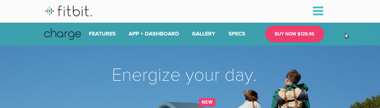
It’s really important that we spend time, effort and if need be, money, on doing a complete makeover of the product pages. Recently, there has also been a trend of having single page design for product pages (see fitbit.com – https://www.fitbit.com/charge#i.14kq4nl15ohdzv), which although, provides maximum field-area to the designer to fit in all the elements to make an ideal product page but is not feasible for large-sized eCommerce stores with products and SKUs running into hundred thousands. Thus, if you too are unsure of the single page design for your product pages and would rather relook at your existing pages, then this checklist is a reliable guide for you to implement what may be the millennial product page.
Our list includes everything, from how a product image should be to the placement of the ‘add to cart’ or the ‘buy now’ button. This list includes features that you most definitely should have on your product pages and a few other less common practices that you can follow to exponentially increase the percentage of conversions on your product pages.
So let’s get down to the factors that are essential to a product page’s performance. But before we begin, we would like to inform you that nothing is a fit-all solution and these best practices are much dependent on testing and real-time results as any other checklist. This checklist of factors is at best considered a guide to keep in mind when approaching your product pages. At worst, you can mistake it to be a CRO gospel.
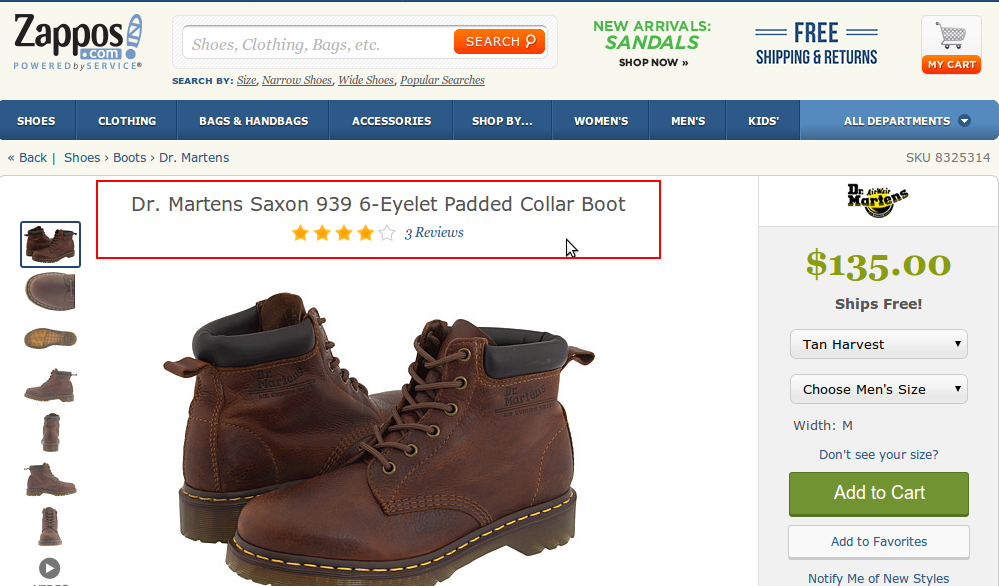
1. Better Product Image/ Video and Display
A clear, zoom-able product image presented in a captivating way can literally get a user hooked. So instead of a low-res product image; a high-res and bewitching product image, taken from as many angles as possible, would be a more logical option. As a store owner, you should be aware of the user’s need to look at the product images clearly and more closely They are not shopping in a physical store, where the product can be picked up and looked at. So it’s essential that product display in the category pages and especially on the product pages, be enticing and clear enough. See how Burberry does it.
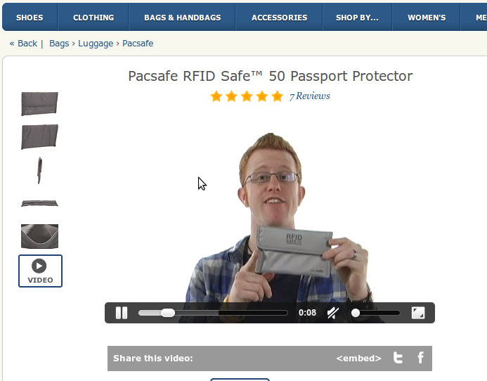
An even more effective product display would be showing the product in use or having a high-quality video of the product being shown. Zappos has many such product videos. The example shown here is that of the Pacsafe RFID passport holder along with product images.
Image 1 Burberry
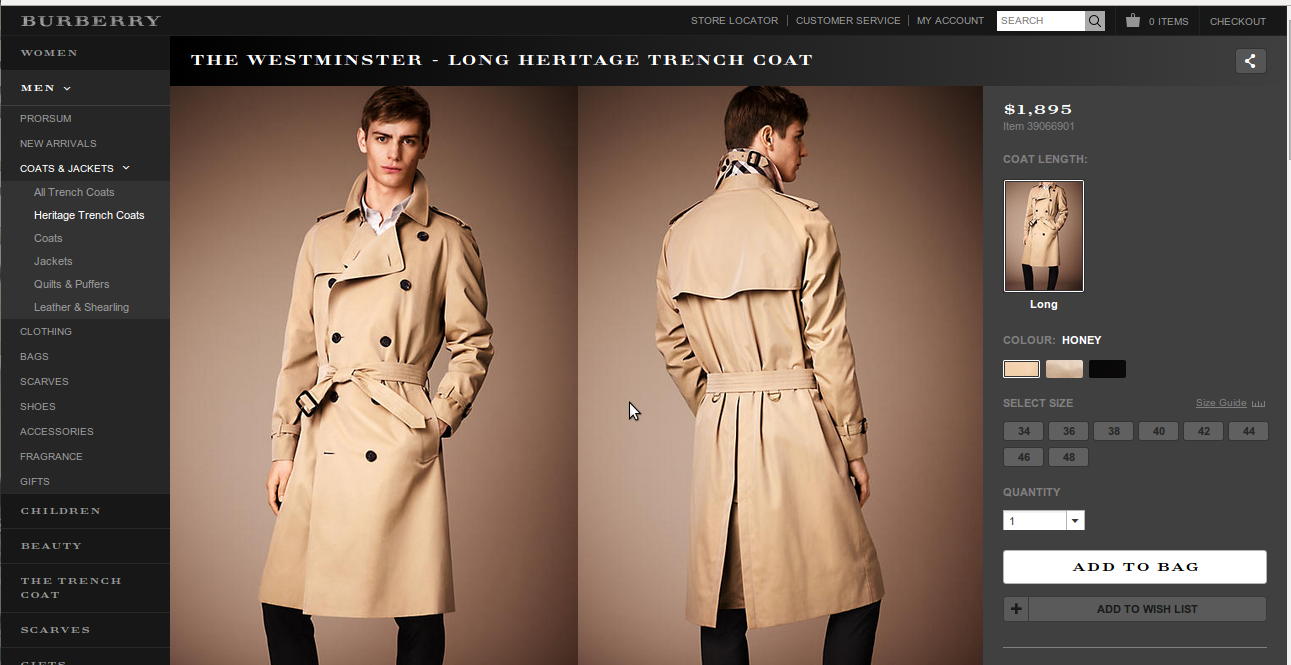
Image 2 Burberry
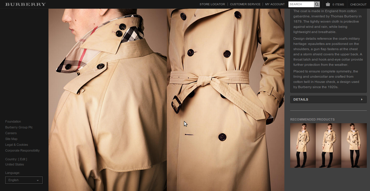
Image 3 Zappos
1.1 Product Name & Display – A minor yet crucial area that one must never overlook. Customers arriving on your store, usually have a basic or generic idea of what they’re looking for. For example, if someone is looking for a white tee, then they will type in white tee in the website search. However, you may have the product by some other name or even a SKU, the customer might not find the desired product and move away from your website. It’s always great to let your customers know what you call the ‘white tee’ in a manner which is visible clearly to them and is also a tad distinct from the design theme of the product page.
Zappos.com even shows star ratings along with the product name which communicates to the user invaluable information about the product in the first glance itself! Image 4: a distinct and clear product name display as on NastyGal.com, along with the number of likes of the product highlighted with the heart icon. Image 3 (above) and Image 5 shows how Zappos does it.
Image 4
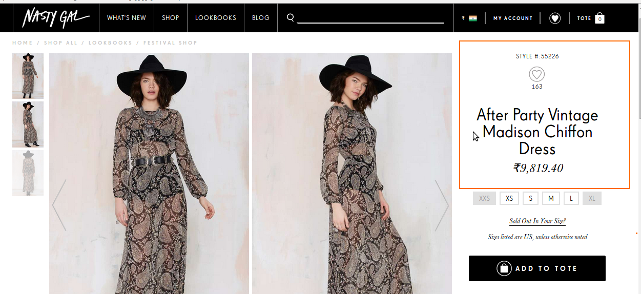
Image 5
1.2 Product Availability –Consider it holy! There’s no greater service to a customer than letting them know about the availability of a product first up! See how Otteny.com & Net-a-Porter.com have got it right. (Image 6)
Image 6 – Otte NY
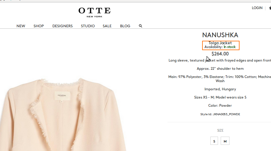
Image 7 – NetaPorter.com
2. Persuasive Product Description
Alright, so you are a store owner with thousands of products to manage and keep stock of. You can’t be bothered with product descriptions. We get that. But manufacturer descriptions aren’t going to do the job for you either. Product descriptions need to be informative, elaborate, easy-to-read, catchy and should NOT be repeated on similar product ranges. Customizing product descriptions will help you get rid of the penalty-worthy duplicate content.
You can use different structures to represent different parts of product information such as pointers, sub-headings, etc.. Use a different way to present stats or highlight product USPs – by using phrases such as “this will be an addition you’ll thank yourself even after years” or “nothing beats its perfection” and so on depending on the product type or characteristic. All this must be done keeping in mind the design and concept of the product page. You can even employ the ‘read/show more’ option (Image 10) so that you can provide the customer the choice to go in for long or short descriptions. There’s no absolutely right or wrong way of writing descriptions but yes, to retain manufacturer descriptions for your products and not invest any time or effort in bettering them will cost you. Keep it real, in sync with the personality of your store and interesting for the reader.
See images below on how different stores have used product descriptions as a great eCommerce touch point.
Short Descriptions
Image -8 Sarah Flint
Short Sub-Categorized Descriptions
Image -9 Jon buscemi
Short Sub-Categorized Descriptions
Here the descriptions have been divided into a brief introduction of the product, USPs and vital information.

Short Descriptions with expandable longer description option: Here, the customer sees the short description but can also view more details on the product by clicking on the highlighted tab– show more information.
This will result in a drop down with more information on the product
Image -10 Zappos
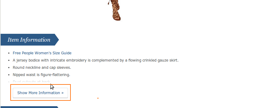
Image -11 Marks and Spencer
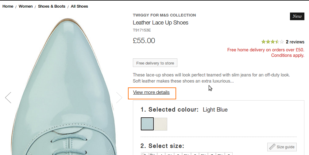
Image -12
In the above image you’ll notice that instead of a drop down, the Marks and Spenser product page has a new window appearing with detailed description, when the ‘view more details’ button is clicked. This is also a good way to save on page space.
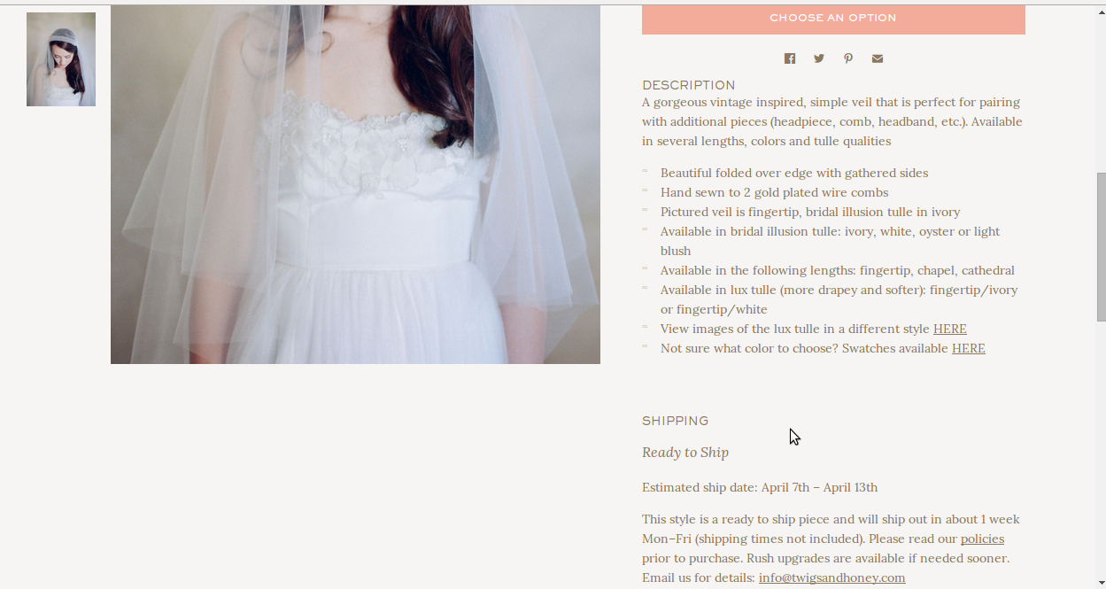
Long Descriptions:
Long descriptions shouldn’t altogether be banned just because being succinct saves you some real estate on the web page. If presented well, like in the images below, using headings, sub-sections, pointers and markers, long descriptions can work well too.
Image -13 Dear Kates
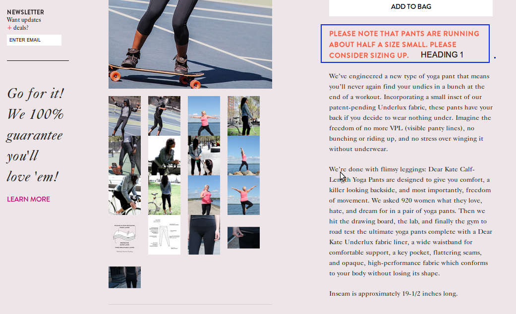
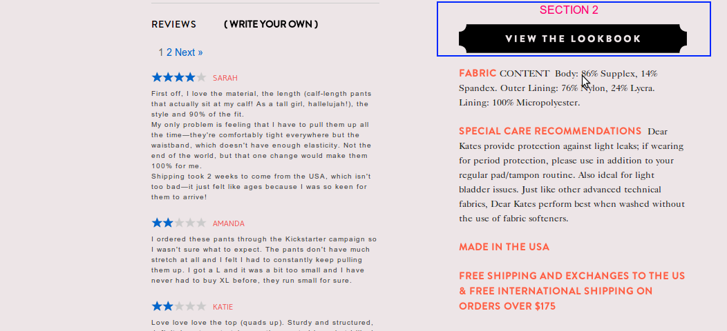
Image -14 Twigs And Honey
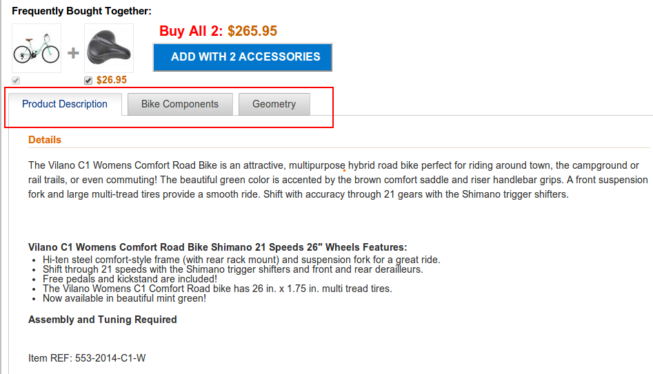
Another way to write product descriptions is to have all the important tabs in a content box See example below:-
Image -15 Road Bike Outlet
You may decide to write and present your product description in whichever way but please make sure that:
- It’s not a lackadaisical mention of weight, dimensions and other features but an interesting read. In other words not a manufacturer description.
- It should be easy to read, presented well, and useful to the customer who is buying.
- It should be in sync with your website design and the overall theme. If you want to be clean, minimal and noiseless then let your content be in the same spirit too.
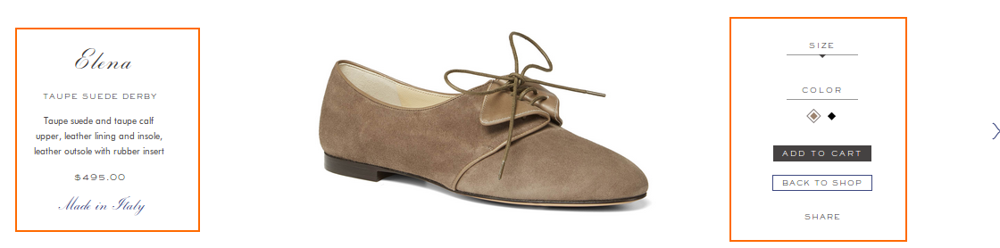
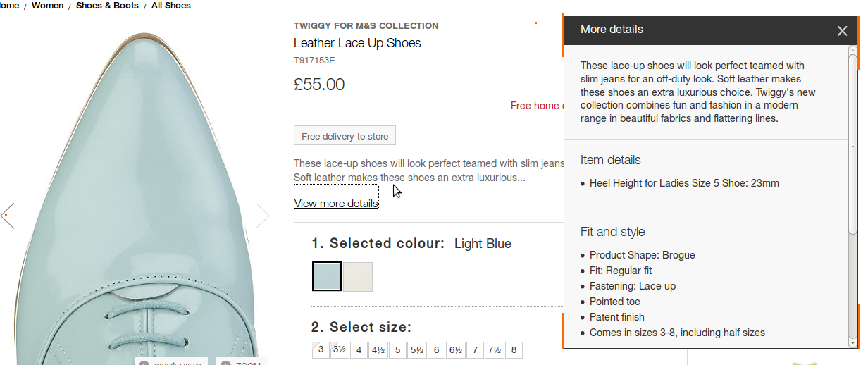
3. Accentuate the Product Size/Color & Price Display
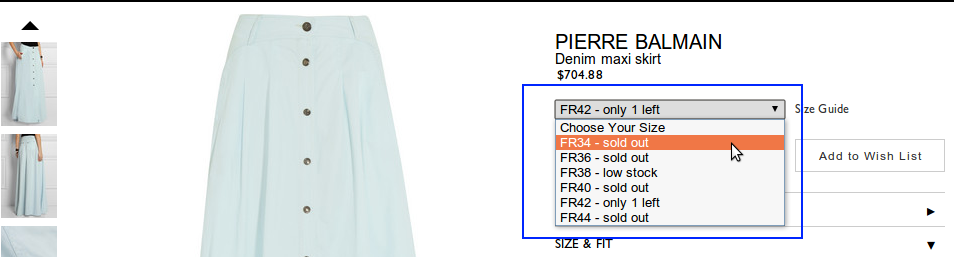
All the vital features and dimensions of the product should be spotlighted/ highlighted clearly.The user should be able to select the size and color easily without him or her having to search for these details. You can separate it from product description by putting them in a box or display it in a way that it stands out without being glaringly obnoxious. Every little modification you make in the presentation of your content must be in line with the design and theme of the page. Another important thing to note here is to give a notification about the selected size being unavailable (see Image 18)*.
Image -16 Sarah Flint
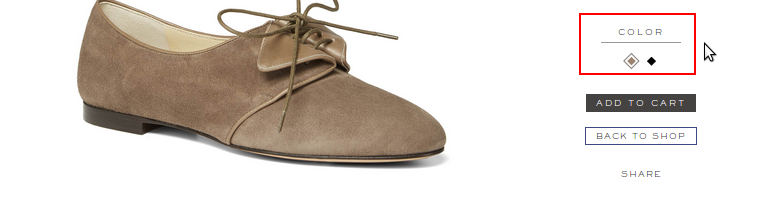
Image -17 Nasty Gal

*Here if you note, below the underlined phrase,
Sold Out In Your Size?
the size listings are clickable and take the user to:
Image -18 Nasty Gal
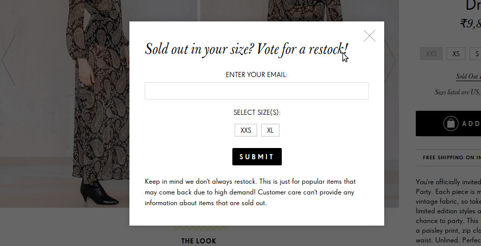
This is a great way to preempt issues that a user is likely to face when making a buying decision and pro-actively giving a solution for it.
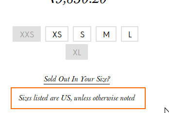
Another great practice is to mention the country which is being taken as the standard for the sizes. Refer to images below
Image -19 Nasty Gal
Some stores mention it along with the size they’re offering such as:
Image -20 Jon Buscemi
For a US or Europe based store that offers international shopping and shipping, one must be intuitive of the thought-flow of a visiting customer. Look at the size guide that Sarah Flint store provides:
Image -21 Sarah Flint

Similarly, you must offer an international customer the option of viewing pricing in the currency of the country he or she belongs to. We’ll come to this point when we cover product pricing and elaborate then.
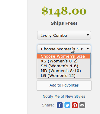
Drop Downs
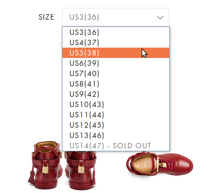
Another way to present size and colors is to introduce drop downs. Drop downs are quite common but of course less user-oriented and friendly than the horizontal menu display which provides a quick and easy way to select sizes. However, if the sizes go beyond S, M, XL, or XXL then you must consider a drop down instead of over-crowding your product page real estate.
Image -22 Job Buscemi
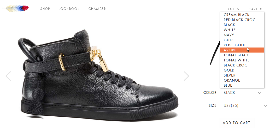
Image -23 Zappo
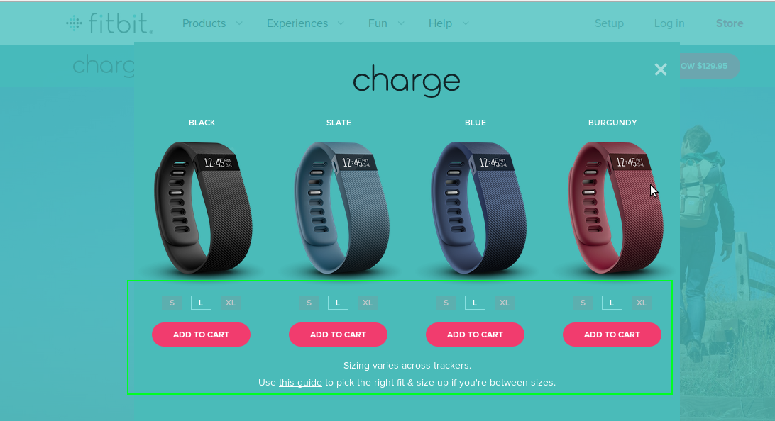
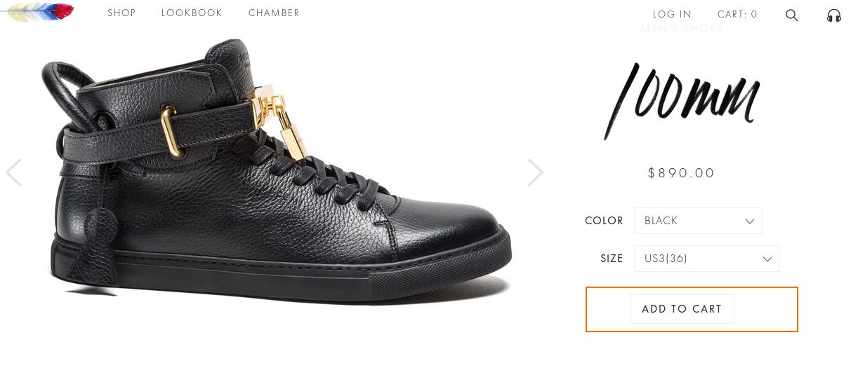
And to venture on a totally new design and functionality path, see how Fitbit does it. Fitbit’s product description spans one full page with detailed features and dimensions. The sizes and colors are shown in a window that appears as soon as the user clicks on the “Buy Now” button.
Image -24 Fitbit Charge
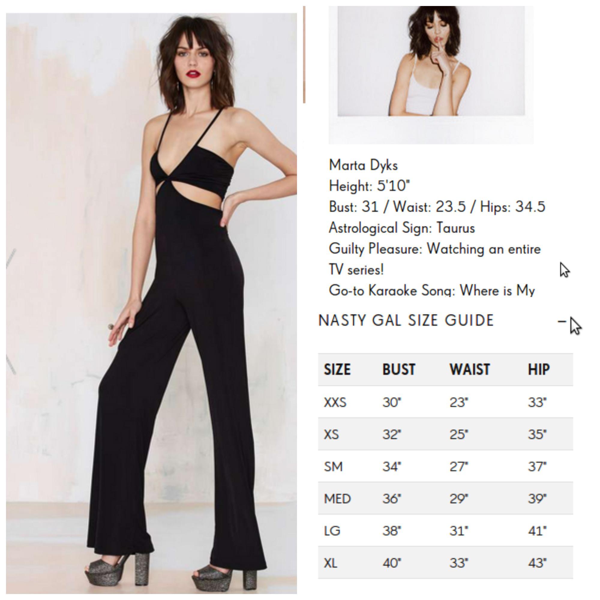
Since size is one of the major concerns for any online buyer, stores are now offering useful information about sizes as much as they can. From model stats to standard size guides, stores provide users all the tools that they can use to approximate the sizes that would fit them much more efficiently than they could, say, a couple of years ago. See the example below:
Image -25 Nasty Gal
4. Pay Attention to the ‘Add to Cart’ button
To put it simply, make it PROMINENT and CONSPICUOUS from surrounding elements!
One way is that you can have the ‘Add to Cart’ button right where you have mentioned the details or have it appear elsewhere all-time. Some stores even have the cart button appear only when the user selects the size or color. This may not be the best of practices as the user with a strong intention to buy, may be piqued at not finding the “Add to Cart” button.
Do not let the “Add to Cart” button get camouflaged with its surrounding design or thematic elements. See below examples of the right way and wrong way to do it:
Do –

Image -26 Nasty Gal
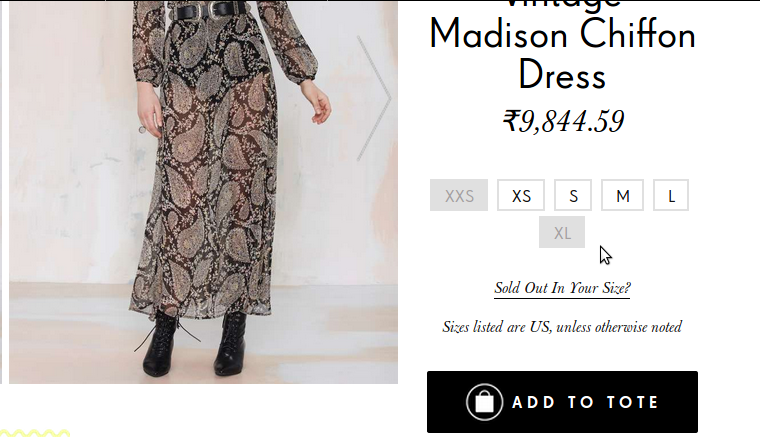
Image -27 Twigs and Honey
Image -28 Fitbit
ADD TO CART
Don’ts
–
✘
Here the “Add to Cart” button is merging with the surroundings and can be missed if the user is not paying attention. Although one may not completely miss it altogether but a button which is better presented will definitely win points from a CRO expert.
5. Highlight Product Pricing/ Cost
Display the cost of a product clearly and unambiguously. The user should be able to notice it without looking for it. You can choose to highlight it (even if it is exorbitant) or let it be in the same tone and theme as the product name and rest of the content.
Dos –
Image -30 Zappos
(When Pricing is Highlighted)
Image -31 Twigs and Honey
(Pricing is not highlighted but not lost either!)
Don’ts – ✘
Pricing here is not as distinguishable as it should be. The font and the font size are almost similar and it can get lost. The only reason why it seems pardonable here is because the design of the page is noise-free.
Image -32 Sarah Flint

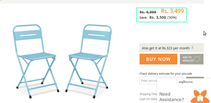
5.1 Discounts & Cut-down Pricing:– Also note that what is more important than highlighting pricing is presenting any discounts or sale prices, on that product, prominently and in clear language.
Dos –
Image -33 Shoe Buy
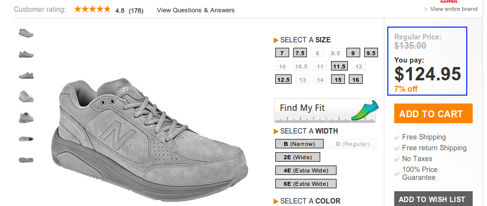
The thing, that Shoebuy.com is doing right here, is that they’re not only showing the regular pricing but distinctly mentioning what the user has to pay under “You Pay”. You can even strike out the original price and show the discounted price in a different color as shown below:
Image -34 Nasty Gal
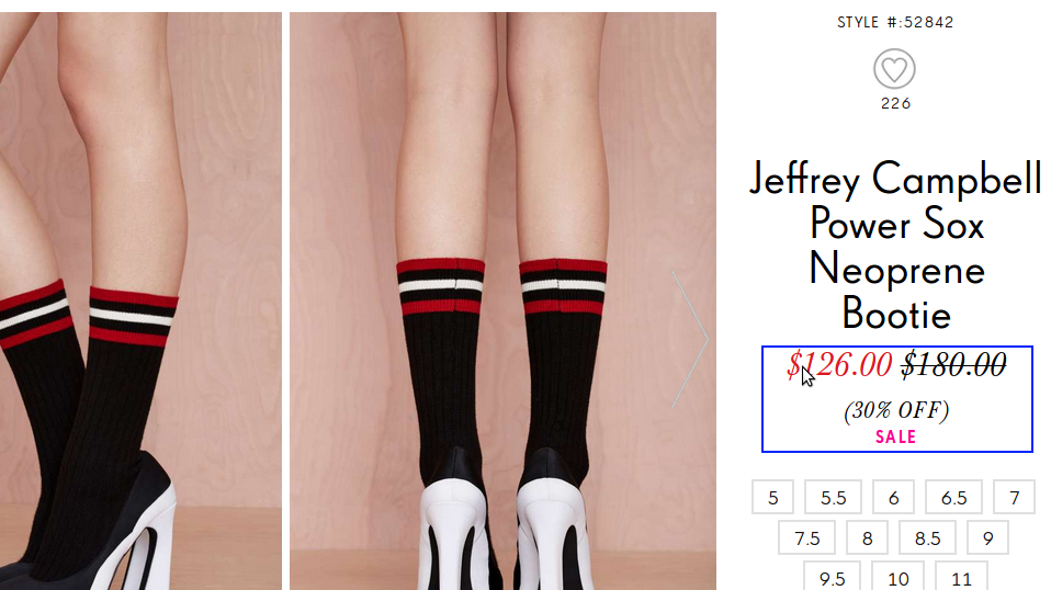
This doesn’t leave any room for confusion of incomprehensibility for the customer. As opposed to the examples shown below:
Don’ts – ✘
In the example below, there are three prices given and in a manner which may appear confusing at first glance. The original price is struck out, which is how it should be. Then the sale price is highlighted in a different color, which is again correct but what is causing the confusion with the pricing is the amount that a user is saving with the 50% off. It’s distracting more than being informative, for the reason that it isn’t well presented.
Image -35 Fab Furnish
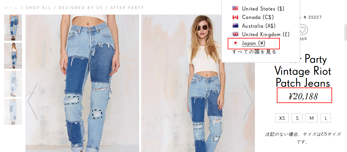
5.2) Displaying Prices in Foreign Currencies on product pages: – If your store offers international shipping, then your store must have the functionality that allows the user to see the pricing in their own native currency. Even if you don’t employ the “translate to other languages” functionality on your e-store, you must, most definitely, offer pricing to be displayed in more than one currency and on both – the home page and the product pages. See how Nasty Gal uses this feature:
Image -36 Nasty Gal

Image -37 Nasty Gal
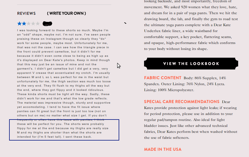
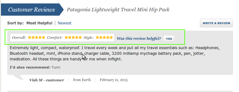
6) Emphasize on Product Reviews: Loud & Clear
Product reviews are now as essential as a beautifully optimized product description! Without product reviews or a tab for them on your product pages, you’re not utilizing a crucial CRO factor that has a direct impact on a customer’s buying decision. Product reviews are not just to increase unique content flux on product pages but act as practical help guides for customers reaching your page and considering buying your product. It’s a great way to communicate the credibility of your product from your other customers whose testimony will matter more than anything you say and how you say about it yourself. A visiting customer will always rely more on the experience and reviews of the customer for product’s utility and overall shopping experience at the store.
So, when including reviews on your product page, make sure they are Prominent, Noticeable and Not Just full of praises. Always keep it real. Check out the review that a customer posted on DearKates.com talking about returning the product in the image below:
Image -38 Dear Kates
Stores featuring product reviews automatically become more trustworthy for users who are now so used to and efficient at online shopping. An intelligent user is not likely to ignore the fact that a store doesn’t feature any review unless it’s a highly popular and well-known brand.
Many stores have started employing product surveys to accompany elaborate reviews, so that the user doesn’t have to spend crucial time in reading a rather long narrative by a customer.
Image -39 Zappos.com

Image -40 Zappos.com
Creating product-specific surveys like Shoe Buy reflects great intuitive thinking on the store’s part.
Image -41 Shoe Buy
You can also make these product reviews SEO-friendly by installing an extension available for Magento 1 based stores.
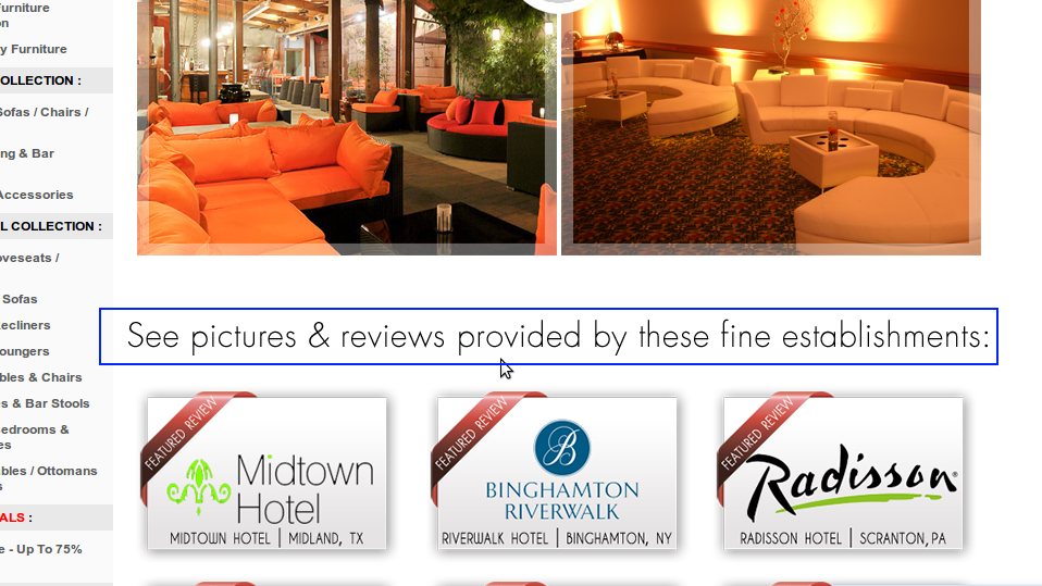
Another great way to increase the credibility of customer reviews is to have them post pictures of them using the product, like Think Geek (Image – 42) and Modern Line Furniture (Image 43) does it. Many stores have now started to invite users to send pictures of the products they sell while they’re being practically used. You can even incentivize this practice by offering customers who post reviews with product pictures, a worthy discount or a feature on your social page/ blog, etc.
Modern Line Furniture has an independent page altogether dedicated to reviews and client photos. Considering the scope and quality of pictures, the number of reviews and the scale of establishments that this page provides the website, this seems to the logical thing to do.
Image -42 Think Geek
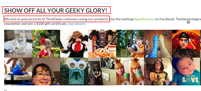
Image -43 Modern Line Furniture
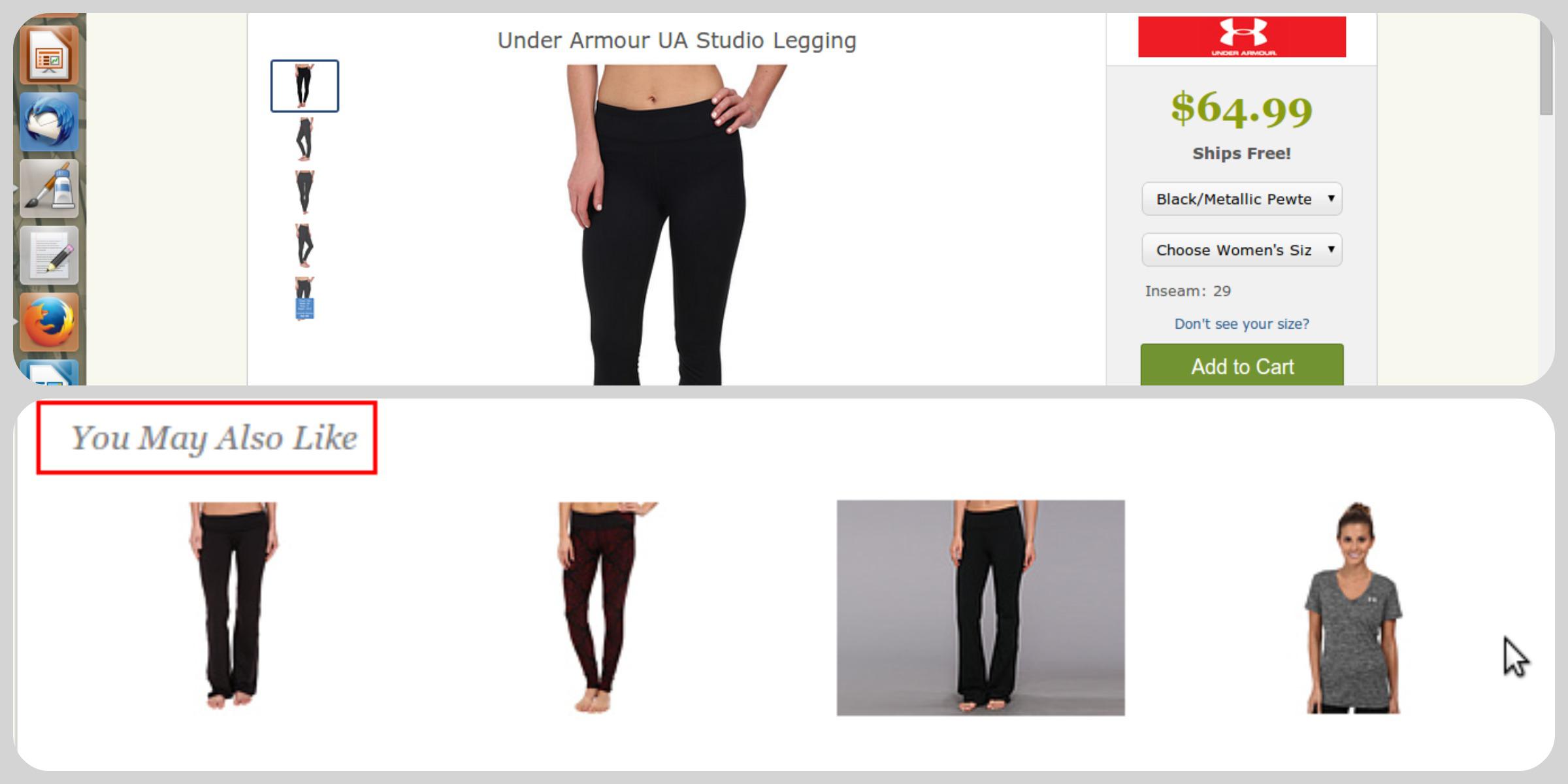
7) Display Related Products
Letting your customers know what complements the selected products allows the customer to continue and add to their shopping cart from the product page itself instead of going back to different category pages. Display a related products tab or a window that showcases products that a user can buy to complement his or her original purchase without frantically searching for them in a web of so many products and categories.
The image below not only shows other related products but also the products that can be bought to complete the look – from make up to shoes for the jumpsuit!
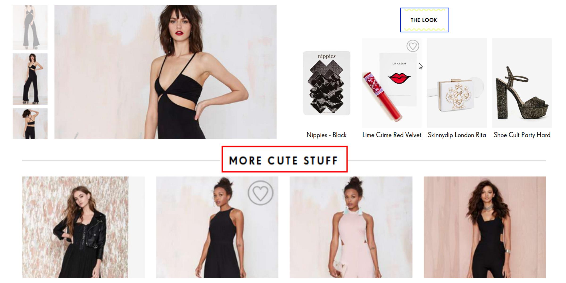
You can choose related products thematically, autonomously or those products that were viewed / bought maximum number of times by other customers with the particular product in point.
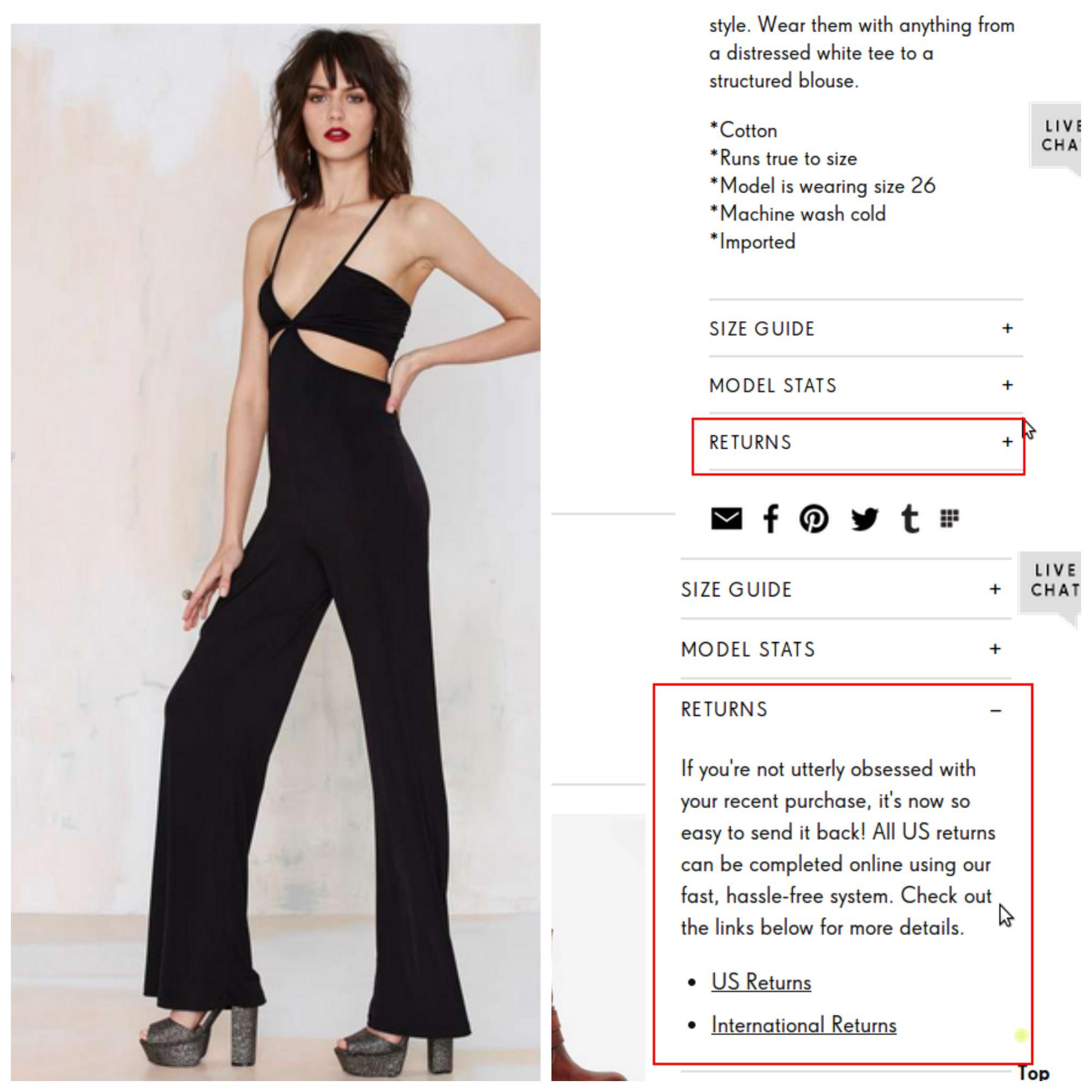
8. Display Shipping Information & Returns policy clearly
Give the customer all the information about shipping and returns on the product page itself. If there’s free shipping on the product then mentioning it can increase the chances of the user clicking on the buy now button.
Image -45 Shoe Buy
Image -46 Zappos.com

Image -47 Nasty Gal
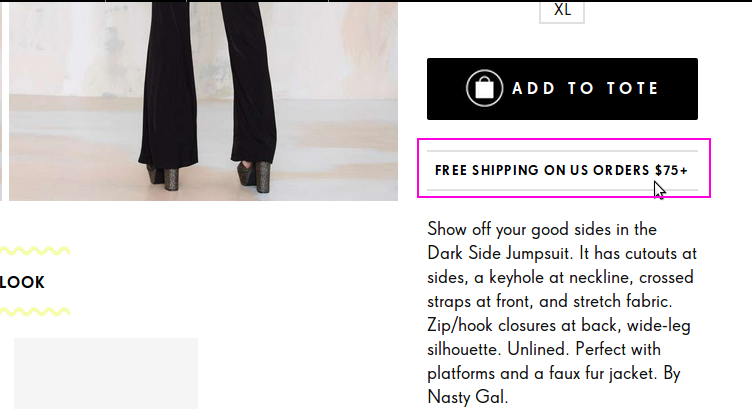
Image -48 Net-A-Porter.com

Image -49 Singer22.com

Image -50 Nasty Gal
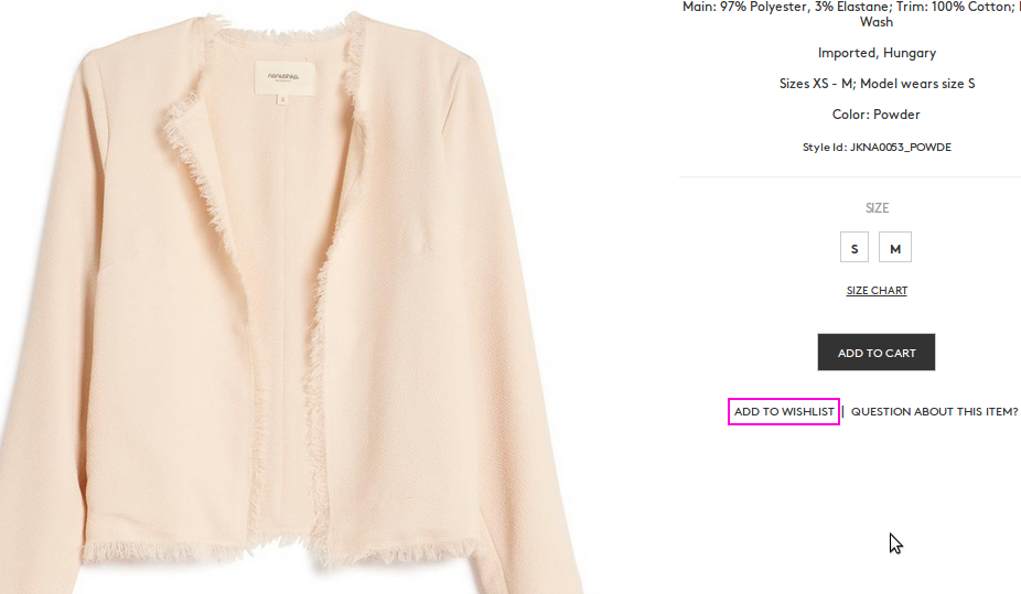
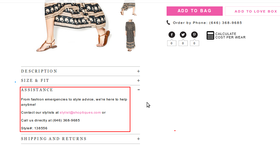
8.1) Additional Must Haves– Once the basic structure of the page is sorted and you are ready with a kick-ass product page. Do not forget to include buttons such as add to favorites/ wishlist, customer assistance, and other items related to the product. If there’s a provision for customers to order the product on phonethen display it prominently.
Image -51 Shoptiques.com

Image -52 Shoptiques.com
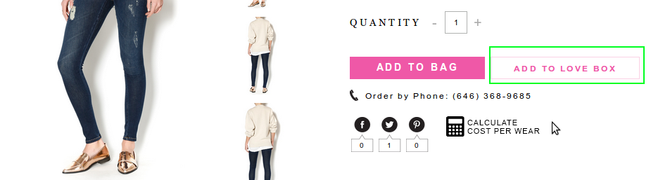
Image -53 Otteny.com
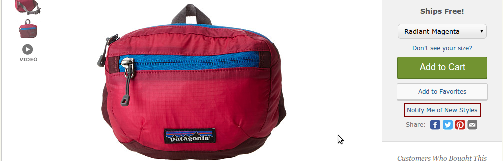
You can also give the customer, the liberty to shop later when new styles are in stock. This way they will not only feel their inhibitions acknowledged but also keep them interested in coming back.
Image -54 Zappos.com
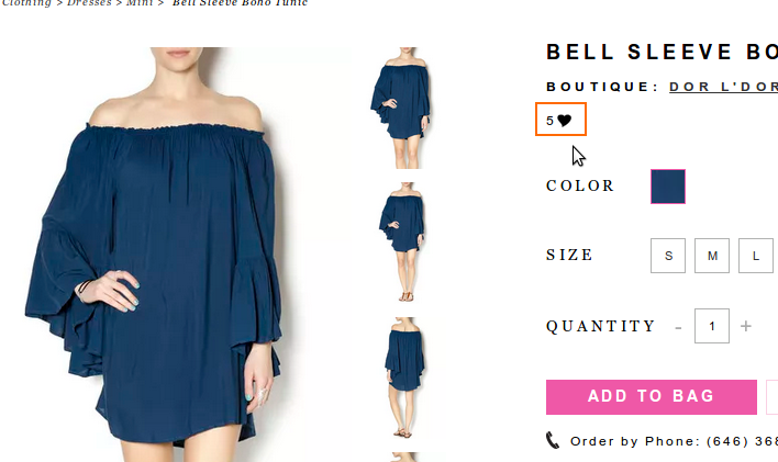
8.2) Show customers how many people have added the product to their favorites or wishlist– t helps the customer to know that his or her choice is actually a popular and preferred one.
Image -55 Nasty Gal
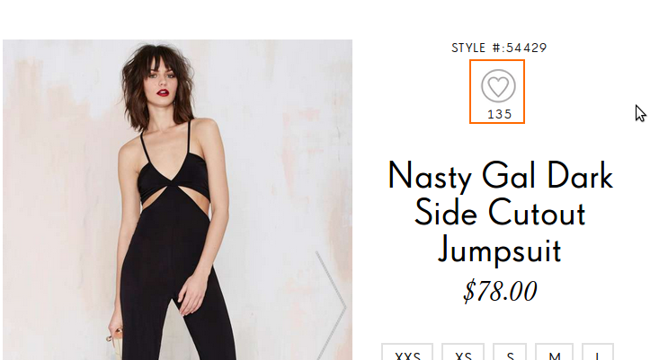
Image -56 Shoptiques.com
8.3) Social Shares & Likes– Allowing customers to share and view social shares of the particular product will be a great advantage for your online store as well as for the customer who is likely to be present on most of the social mediums. Even if a user doesn’t buy your product but shares it on any of the popular social sharing websites, the product will receive all the attention that it wouldn’t have otherwise while staying tucked as one of the web pages on your store. If you haven’t already, do enable this functionality on all of your product pages. There is also a Magento extension that allows users and visitors to share product page URLs on Whatsapp apart from the usual Facebook, Twitter or instagram shares. You can download the extension here. The Whatsapp share button is visible only on mobile websites. So there’s now one more reason why you, most definitely, have responsive product page designs.
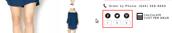
Please note– The position of all these additional must-haves and social shares is extremely important. Rarely will a customer scroll down to the bottom of the product page, to closely examine each and every aspect. Even if they do, there’s no guarantee that customers will not skip these. In the example below of the Nasty Gal jumpsuit, the social share icons are a way towards the bottom of the page which may result in rendering the effort of enabling the functionality in the first place, totally futile.
Image -60 Nasty Gal
The social sharing buttons are way too down but there is a wise thing that the designers introduced in the product page design, the scroll up button called “Top” that contributes that counters the not-so-good feeling of scrolling down to see social shares.
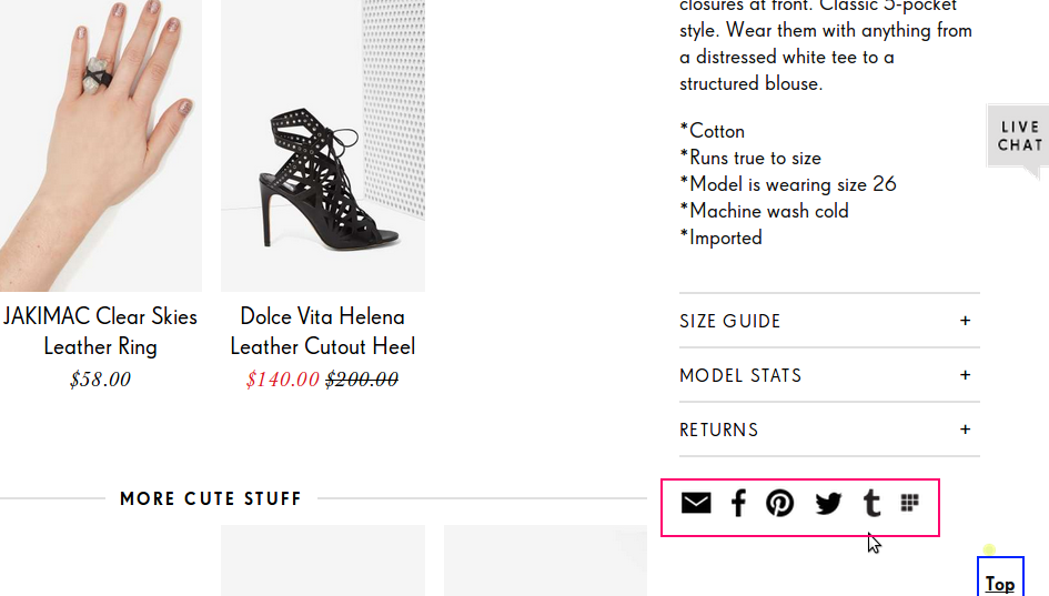
8.4) Customer Assistance – There may be issues and concerns that a person may have before finalizing on the decision to complete the purchase. Having tools such as Live Chat, customer assistance details can be immensely helpful and useful to the user who may want to ask about the product he or she has selected or who may have some other general query about payment or shipping.
Image -61 Nasty Gal

Image -62 Shoptiques.com
Small changes can lead to big spikes in your data on your analytics
Keep track of the traffic graph after you have made these changes for comparison with the data of standard pages.
Touchpoint optimization isn’t simply making products available on a website but rather presenting them in a way that decreases the chances of a user getting lost (or squinting to find useful information). It is a reminder of a better in-store experience but most of all leads to the possibility of a conversion.
However, in order to include all these elements, you must not compromise on page load speed. Talk to your development team and see how you can have a “well-optimized” product page without forfeiting the most fundamental aspect of online shopping – quick and speedy processes – in the bargain.
Additional reading – How to measure site speed
As a store owner, you must be intuitive enough to visualize user behavior, experience, and expectations. Keep in mind that your product pages are not just there to facilitate the purchase process but to seal them. If you are just starting to build an eCommerce store then this checklist will prove even more beneficial. But even so, if there’s an overhaul on your mind, then also you may find the article useful. Add more power to your knowledge with our other much-loved and much-shared articles: 91- Point Check-list – Holy Grail of eCommerce Optimization and the 40-Point Checklist for a Successful Https to Http Migration Or check out the newly launched Black & White theme that we recently launched for Magento 1 stores.
P.S– We will follow this article with one on the right practices for the Checkout page, the page where most cart abandonments are likely to happen. So do not forget us 
Reference Websites:
- www.Zappos.com
- http://us.burberry.com/
- http://www.nastygal.com/
- https://www.singer22.com/
- http://www.shoebuy.com/
- www.ThinkGeek.com
- www.Net-a-Porter.com
- www.Fitbit.com
- www.FabFurnish.com
- www.TwigsandHoney.com
- www.Otteny.com
- www.Shoptiques.com
- www.ModernLineFurniture.com
- www.RoadbikeOutlet.com
- About the Author
- Latest Posts
I am a writer, reader, and a part time adventure and travel enthusiast. The other three things that vie for my mind share are dark chocolate, coffee, and photography. I am highly motivated by user perspectives and addressing the common human experience when I write.

Nosheen
I am a writer, reader, and a part time adventure and travel enthusiast. The other three things that vie for my mind share are dark chocolate, coffee, and photography. I am highly motivated by user perspectives and addressing the common human experience when I write.
MORE POSTS-
Evaluating the Carbon Emissions of Shopify Themes
by Harleen Sandhu
Committing to green claims as a business is a huge promise to deliver on. For ecommerce stores, Shopify is leading …
Continue reading “Evaluating the Carbon Emissions of Shopify Themes”
-
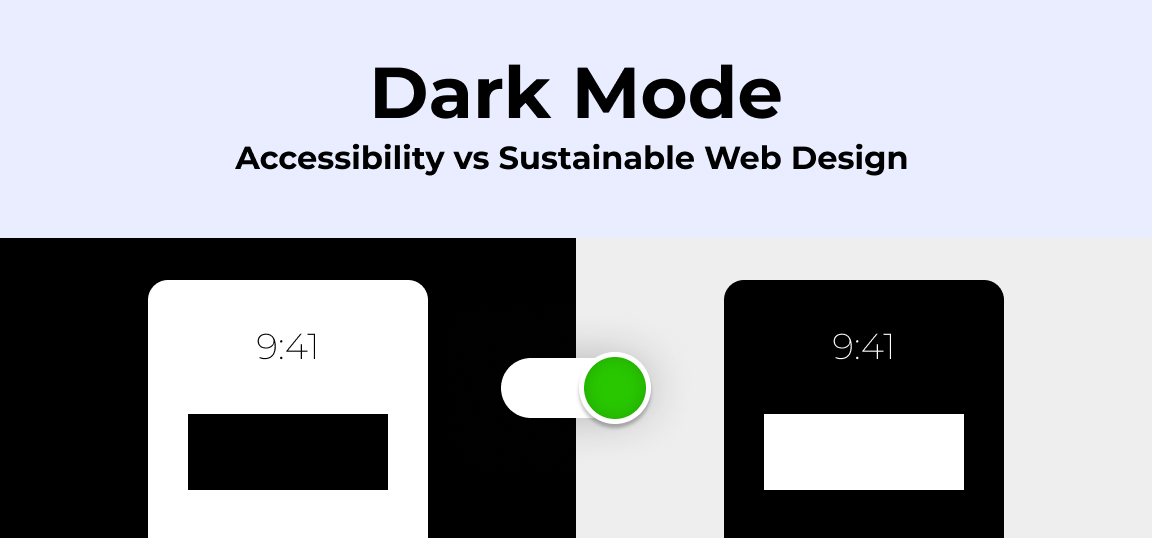
Dark Mode: Accessibility vs Sustainable Web Design
by BalbirIntroduction Dark mode, a feature that lets users switch the color scheme of an app or website to darker colors, …
Continue reading “Dark Mode: Accessibility vs Sustainable Web Design”
-
Discover Essential Sustainable Marketing Principles and Strategies for Ethical Business Growth
by Pancham Prashar
Given the major issues that our world is currently facing, such as pollution and climate change, sustainability becomes an inevitable …
-
Show, Don’t Tell: Demonstrating Transparency in Your eCommerce Store
by Pancham Prashar
For an eCommerce brand committed to good, success goes beyond creating excellent products; it extends to effectively communicating your values …
Continue reading “Show, Don’t Tell: Demonstrating Transparency in Your eCommerce Store”
-
How to Market Sustainable Products Effectively
by Nida Danish
In today’s market, sustainability has evolved from a passing trend to a pivotal consideration for both consumers and businesses. Globally, …
Continue reading “How to Market Sustainable Products Effectively”
-
Decoding B Corp Marketing Challenges: Strategies for Success
by Nida Danish
Today, businesses place high importance on sustainability and ethical practices. For B2B and e-commerce leaders, being a certified B Corp. …
Continue reading “Decoding B Corp Marketing Challenges: Strategies for Success”