

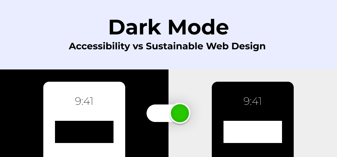
Dark Mode: Accessibility vs Sustainable Web Design
Introduction
Dark mode, a feature that lets users switch the color scheme of an app or website to darker colors, has become popular lately. People like it because it is aesthetically pleasing, reduces eye strain, and can save energy.
But not everyone is on board with dark mode. Some worry that it might make things harder to read or mess up the user experience. There’s also a debate about its impact on the environment and how it fits into the idea of sustainable web design.
Understanding Dark Mode
Dark mode is a display setting for websites and applications that features light text on a dark background. It is designed to reduce eye strain in low-light conditions, save battery life on certain (OLED & AMOLED) screens, and offer an aesthetic alternative to traditional light backgrounds.
Dark mode started way back in the early days of computers but became popular when graphical interfaces and better displays came along. Today, operating systems like iOS, Android, and macOS all offer dark mode. People are aware of eye strain and digital fatigue, so they prefer dark mode. That’s why you see it everywhere in apps and websites.
While dark mode brings advantages in accessibility and sustainability, some studies disagree on its necessity. Critics argue it might not be as crucial as claimed. They point out potential issues like accessibility concerns, reduced readability and uniform design. Despite its benefits, dark mode should be carefully considered alongside other design factors for a balanced digital experience.
Explore our 5 Steps to Achieve Success in Purpose-Driven Content Marketing to seamlessly infuse sustainability into your brand narrative and authentically engage your audience with meaningful content.
Dark Mode and Accessibility
Dark mode is known for its ability to reduce eye strain, but it may not always be the ideal choice for individuals with visual impairments. While it offers benefits like reduced glare and improved readability for many users, there are several factors to consider that could make dark mode less suitable for those with low vision or certain eye conditions.
Perkins School for the Blind provides further insights into the impact of dark mode on accessibility for users with varying visual needs.
- Contrast Issues: Dark mode may not always provide sufficient contrast, such as gray text on a black background, which can pose challenges for users with low vision.
- Color Preferences: Some users may prefer alternative text colors, like yellow or green, on dark backgrounds, rather than the default white text.
- Color Blindness and Eye Conditions: Individuals with colorblindness or specific eye conditions may find it more difficult to use displays with darker colors, or they may find dark mode impractical altogether.
- Visibility in Bright Environments: Devices with dark mode enabled can be challenging to read in brightly lit environments or direct sunlight, which could further hinder accessibility for users with visual impairments.
- Disorientation: For users who rely on color cues for navigation, the dark mode can be disorienting, as it often removes or alters colors, making it harder to navigate a screen or website.
Benefits for Users with Visual Impairments
Users who suffer from light sensitivity, photophobia, or certain types of color blindness may find their discomfort and eye strain lessened by the decreased brightness and glare that come with using the dark mode. Dark mode makes it easier for these users to interact with digital content by making viewing more comfortable.
ADA Compliance
Another critical aspect of dark mode concerning accessibility is ADA compliance. The Americans with Disabilities Act (ADA) sets standards for accessibility in digital design to ensure that websites and applications are usable by individuals with disabilities.
Incorporating dark mode into a website or application should align with these accessibility standards to ensure inclusivity for all users.
Here are the specific instructions from the ADA guidelines regarding color contrast and readability:
- Color Contrast: The ADA guidelines recommend a minimum color contrast ratio of 4.5:1 for normal text and 3:1 for large text. This ensures that text is distinguishable from its background for users with visual impairments.
- Text Readability: Text should be easy to read, with a font size of at least 12 points or 9 points bold for normal text. Additionally, avoid using thin or ornate fonts, as they can be difficult to read for users with low vision.
- Navigation Ease: Websites should have clear and consistent navigation menus, with descriptive labels for links and buttons. Users should be able to navigate through the site using a keyboard alone, without relying on a mouse.
Contrast and Readability
Contrast ratios are crucial for making text and visuals easy to read, especially for people with vision problems. In dark mode, the stronger contrast between text and background colors makes things easier to see, which is great for people with low vision or color vision issues.
While some users love dark mode because of its benefits, others might struggle with certain color combinations or just prefer the classic light mode. Giving users the choice to pick their own colors can solve these problems and make sure everyone feels included.
Research Insights on Dark Mode
Studies have indicated that dark mode can lead to decreased eye fatigue and improved visual comfort, particularly in low-light environments or during prolonged device use. A detailed study from the Digital Library of the Association for Computing Machinery (ACM) shared the following:
Visual acuity test results
- Participants demonstrated significantly higher visual acuity in dark mode compared to light mode.
- Dark mode resulted in fewer errors and faster completion times in visual acuity tests.
- Fewer errors occurred in high-light environments compared to low-light environments.
Visual fatigue
- Participants reported significantly lower levels of visual fatigue in dark mode compared to light mode.
Disclaimer: It’s important to be careful when looking at these findings. People might have different preferences, and things like how bright their screen is or the lighting around them can change the results. This is an area that needs more research to really understand how dark mode affects people’s experiences, especially for different groups of people with various accessibility needs.
Dark Mode and Sustainable Web Design
Dark mode’s potential goes beyond sleek aesthetics. Developers and designers are increasingly recognizing its power to reduce our digital emissions and make our online world greener. This trendy feature is not only enhancing our user experience but also leading us towards a more eco-friendly online journey.
Sustainable Web Design Explained
Sustainable web design involves making websites and digital products more environmentally friendly. It’s important because it helps reduce energy use and carbon emissions. Developers achieve this by optimizing code, keeping file sizes small, and using renewable energy for hosting websites. With more consumers becoming conscious of the impact our web usage causes on the environment, businesses and developers are focusing more on sustainable web design to lessen their environmental impact and leave a smaller carbon footprint.
Energy Savings with Dark Mode
Devices with OLED (Organic Light-Emitting Diode) and LED (Light-Emitting Diode) screens can save energy by using the dark mode. Unlike traditional LCD screens that use a backlight to light up all pixels, OLED and LED screens can turn off individual pixels to show darker colors. This means that using dark mode on these screens uses less energy compared to light mode, where more pixels need to be lit up.
Dark Mode Design Hurdles: Enhancing User Experience
While implementing dark mode might seem straightforward, it’s essential to navigate potential challenges to ensure a seamless user experience. Here are key considerations and tips for overcoming common dark mode design hurdles:
Graphics Optimization
Ensuring graphics maintain visibility and aesthetic appeal in both light and dark modes is crucial. Graphics with non-transparent backgrounds can pose visibility issues when transitioning to dark mode. Opt for SVG, WEBP, or PNG formats to support transparency and prevent elements from becoming obscured against dark backgrounds.
Layered Elements and Overlays
Creating depth through layered UI elements often involves using shadows and translucent scrims. However, in dark mode, these overlays may become less visible or lose their intended effect. Adjusting the opacity and color of overlays can help maintain visual hierarchy and ensure clarity in both light and dark modes.
Font Legibility
Thin fonts may get lost against dark backgrounds, while thick fonts can appear overly bold and challenging to read. Additionally, poor color contrast between text and background can hinder legibility. Choosing fonts with adequate weight and adjusting color contrast levels can enhance text readability in dark mode.
Color Contrast Compliance
Highly saturated colors on dark backgrounds may fail to meet accessibility guidelines, compromising visibility for users with visual impairments. Aim for sufficient color contrast ratios to ensure text and UI elements remain discernible in both light and dark modes, adhering to accessibility standards set by WCAG 2.0.
Consistent Page Structure
Dividers and visual markers play a vital role in organizing content on a page. However, these elements may blend into the background in dark mode, disrupting page structure and navigation. Employing subtle color differentiators and maintaining consistent design patterns can improve content organization and user comprehension.
Floating Components and Scannable Codes
Elements designed to stand out, such as floating buttons or scannable codes, should remain distinctive across different modes. Consider adjusting color schemes or providing alternative formats for scannable codes to ensure compatibility with diverse scanning devices and environments.
As we navigate the path to sustainable marketing, we encounter various challenges. Explore our guide to Decoding B Corp Marketing Challenges: Strategies for Success for valuable insights into overcoming these hurdles.
Implementing Dark Mode Responsibly
Let’s explore how developers and designers can create an exceptional dark mode experience while considering accessibility and sustainability.
Best Practices for Developers and Designers
1. Accessibility Matters: Make sure that text is easy to read in dark mode by choosing colors with good contrast. This helps users with vision impairments.
2. User Choice: Let users pick if they want dark or light mode. Also, give them options to adjust things, like brightness.
3. Test and Listen: Test dark mode with different people to see how they find it. Listen to their feedback and make improvements based on what they say.
4. Keep Things Consistent: Make sure that the design looks the same in both dark and light modes. This helps users switch between modes without getting confused.
Tools and Frameworks
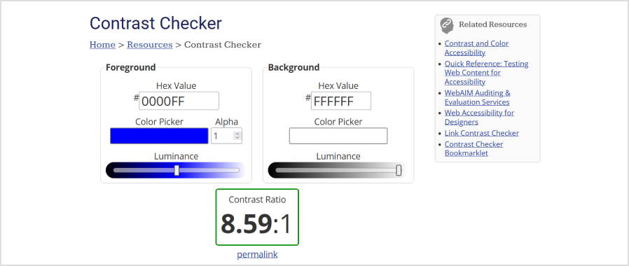
1. Check Colors: Use tools that check if the colors you’re using in dark mode are easy to see. Tools like Contrast Checker can help you make sure your design meets accessibility standards.
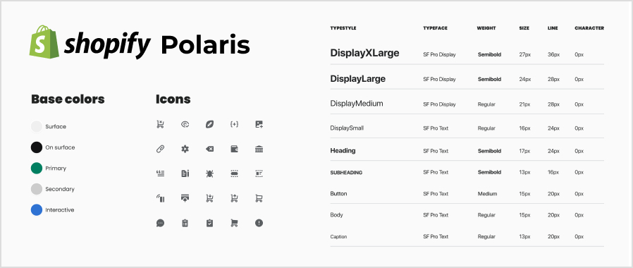
2. Use Design Systems: Design systems like Material Design or Shopify’s Polaris provide guidelines and tools for making dark mode look great on your app or website.
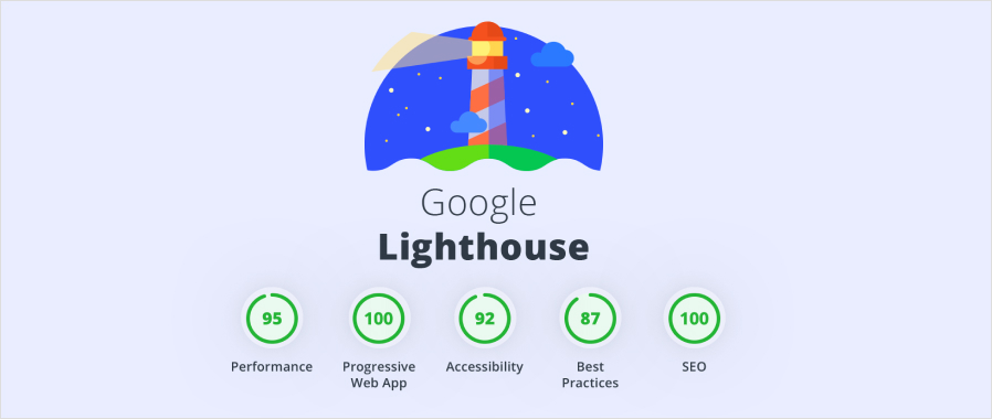
3. Optimize Performance: Make sure your dark mode design doesn’t slow things down. Tools like Lighthouse can help you make your website faster and more efficient.
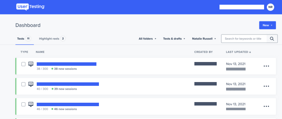
4. Listen to Users: Get feedback from real users to see how they like your dark mode design. Tools like UserTesting can help you gather feedback and make improvements.
By following these tips and using the right tools, you can create a dark mode that’s accessible, user-friendly, and good for the environment.
Some Successful Examples
Dark mode improves the user experience, accessibility, and sustainability across various platforms and apps. By adding dark mode to their products, companies meet user needs and make the digital world a bit greener.
Here are two famous examples showing how adding dark mode made a difference:
1. Reddit
Reddit introduced its dark mode in 2018, after years of requests from Reddit users. Initially labeled “night mode,” this feature replaced Reddit’s default white background with a darker one.
Despite the benefits of dark mode, many Reddit users are not in favor of using it permanently. They have expressed a preference for switching between dark and light mode depending on the atmosphere in which they are using the app.
2. Slack
Slack, a leading communication platform, introduced dark mode for mobile devices in March 2019, followed by its desktop counterpart in September of the same year. At CueBlocks, slack is one of our primary internal messaging tools. This app offers users a visually comfortable option through this feature, particularly in low-light environments or during extended periods of usage.
Conclusion
Dark mode’s popularity has soared, prompting debates on its importance in web design. Yet, it’s more a preference than a must-have. Users behave similarly without it, implying it’s not universally crucial. They view dark mode at the system level, not just in specific apps.
Looking ahead, dark mode’s growth isn’t slowing. With a push for inclusive and eco-friendly design, expect it to become more refined and flexible. This means better customization to suit different users and smoother integration into design systems for consistency across platforms.
In conclusion, dark mode offers a great chance for designers, developers, and businesses to focus on accessibility, sustainability, and user-centred design. By carefully adapting dark mode and integrating it into their products, businesses can improve user experiences, lessen environmental impact, and contribute to a more inclusive and eco-friendly digital world.
- About the Author
- Latest Posts
Hi, I’m Balbir Singh! I’ve been working with CueBlocks as a UI/UX Designer for over two years. I’m passionate about crafting seamless and visually engaging user experiences.

Balbir
Hi, I'm Balbir Singh! I've been working with CueBlocks as a UI/UX Designer for over two years. I'm passionate about crafting seamless and visually engaging user experiences.
MORE POSTS-
Evaluating the Carbon Emissions of Shopify Themes
by Harleen Sandhu
Committing to green claims as a business is a huge promise to deliver on. For ecommerce stores, Shopify is leading …
Continue reading “Evaluating the Carbon Emissions of Shopify Themes”
-
Dark Mode: Accessibility vs Sustainable Web Design
by BalbirIntroduction Dark mode, a feature that lets users switch the color scheme of an app or website to darker colors, …
Continue reading “Dark Mode: Accessibility vs Sustainable Web Design”
-
Discover Essential Sustainable Marketing Principles and Strategies for Ethical Business Growth
by Pancham Prashar
Given the major issues that our world is currently facing, such as pollution and climate change, sustainability becomes an inevitable …
-
Show, Don’t Tell: Demonstrating Transparency in Your eCommerce Store
by Pancham Prashar
For an eCommerce brand committed to good, success goes beyond creating excellent products; it extends to effectively communicating your values …
Continue reading “Show, Don’t Tell: Demonstrating Transparency in Your eCommerce Store”
-
How to Market Sustainable Products Effectively
by Nida Danish
In today’s market, sustainability has evolved from a passing trend to a pivotal consideration for both consumers and businesses. Globally, …
Continue reading “How to Market Sustainable Products Effectively”
-
Decoding B Corp Marketing Challenges: Strategies for Success
by Nida Danish
Today, businesses place high importance on sustainability and ethical practices. For B2B and e-commerce leaders, being a certified B Corp. …
Continue reading “Decoding B Corp Marketing Challenges: Strategies for Success”
One Reply to “Dark Mode: Accessibility vs Sustainable Web Design”