

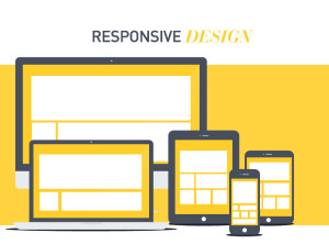
Responsive Design – New Age Mobility Solution
Gone are the days of sole desktop computing, with the advent of handheld devices, the e-commerce giants are feeling an increasing need to make their websites readily accessible on all kinds of devices from desktops to phablets and all others in between.
The best solution for having a widespread and an effective online presence is to go responsive! Responsive design is a way of configuring and formatting a particular website as per the screen size of various devices so that it is easy to surf and scan. Responsive web design is the biggest possibility in today’s age for e-commerce websites to extend their reach and boost sales.
Why you need to go responsive?
Building websites or web apps for a single screen is no longer a profitable strategy. With most people doing most of their work on the move, you never know what device is being used to reach you. The multi-screen plan of action and making your websites and apps adaptable to any screen is the ideal way to:
Hassle-free maintenance – Through responsive design a website has just one version of webpages with same URL and HTML that makes sharing, engaging and interacting across different platforms easy. The process of making changes and adding features to a responsive site is much easier than to a multi-device site.
Rank higher in search engines – Google being the most popular and preferred search engine recommends having a responsive website for better and higher rankings. Through responsive design, only one page is served that suits all devices and this solves the problem of duplication of content. If a business has separate versions of their website for different devices, this not only leads to duplication of content and a drop in rankings but also results in a complex set of redirects difficult to manage.
Improved conversion rates – With e-, m- and t-commerce becoming the norm, it is essential to make your website and app compatible with different devices. If your web page does not open on a certain device, it leads to an increase in bounce rates and decreases the chances of conversion.
Better user experience – Say no to zooming and shrinking of text and images with responsive designing. Everything should auto adjust itself as per the size of the screen. It facilitates ease of navigation with minimum resizing, panning and scrolling. The end goal is to deliver a happy and quality user experience which responsive design does seamlessly.
Cost Effective – Earlier while building multiple versions of the same website, the design and development costs skyrocketed, but with responsive design both time and money are saved as there is just one source code of a single website to be maintained.
In no time responsive design will become a norm and will be the preferred choice over a separate mobile site or a native web application. So get on with it, if you haven’t already. Share your experiences or thoughts on responsive design with us in the comments.
- About the Author
- Latest Posts
With experience and expertise in the copywriting field that spans years, I am particularly conscious about organization, marketing value, and a good feel when I write. I love poetry, photography, good books, and coffee too!

Saburi Mehra
With experience and expertise in the copywriting field that spans years, I am particularly conscious about organization, marketing value, and a good feel when I write. I love poetry, photography, good books, and coffee too!
MORE POSTS2 Replies to “Responsive Design – New Age Mobility Solution”
Comments are closed.
-
Evaluating the Carbon Emissions of Shopify Themes
by Harleen Sandhu
Committing to green claims as a business is a huge promise to deliver on. For ecommerce stores, Shopify is leading …
Continue reading “Evaluating the Carbon Emissions of Shopify Themes”
-
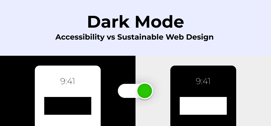
Dark Mode: Accessibility vs Sustainable Web Design
by BalbirIntroduction Dark mode, a feature that lets users switch the color scheme of an app or website to darker colors, …
Continue reading “Dark Mode: Accessibility vs Sustainable Web Design”
-
Discover Essential Sustainable Marketing Principles and Strategies for Ethical Business Growth
by Pancham Prashar
Given the major issues that our world is currently facing, such as pollution and climate change, sustainability becomes an inevitable …
-
Show, Don’t Tell: Demonstrating Transparency in Your eCommerce Store
by Pancham Prashar
For an eCommerce brand committed to good, success goes beyond creating excellent products; it extends to effectively communicating your values …
Continue reading “Show, Don’t Tell: Demonstrating Transparency in Your eCommerce Store”
-
How to Market Sustainable Products Effectively
by Nida Danish
In today’s market, sustainability has evolved from a passing trend to a pivotal consideration for both consumers and businesses. Globally, …
Continue reading “How to Market Sustainable Products Effectively”
-
Decoding B Corp Marketing Challenges: Strategies for Success
by Nida Danish
Today, businesses place high importance on sustainability and ethical practices. For B2B and e-commerce leaders, being a certified B Corp. …
Continue reading “Decoding B Corp Marketing Challenges: Strategies for Success”
Great advice we will surely follow it.
Responsive website design is the need of the day. We should take it very seriously, while designing our sites.